
Key Takeaways
- Zip code mapping enables sales analysis and location optimization
- Multiple mapping tools available, such as CARTO, QGIS, Esri, Kepler.gl, Mapbox, MapInfo, Felt, Foursquare Studio, Tableau and Power BI
- Choose tools based on ease of use, customization, analysis, and budget
- Use accurate geocoded data for reliable international coverage
Introduction
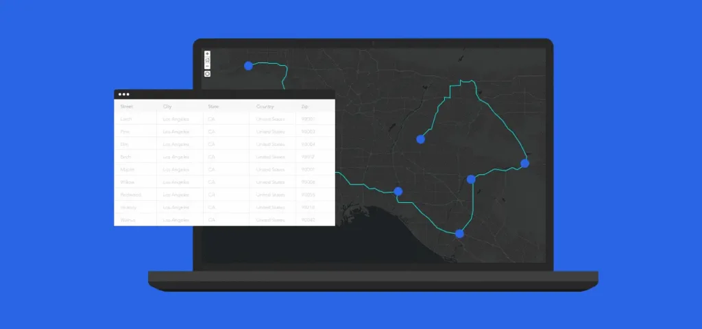
Business decisions often require the mapping of zip codes. For instance, businesses might want to analyze sales data of purchasing patterns. A sales operations team might want to explore new possibilities for sales territories’ designs using ZIP code heat map that rely on color to reveal different intensity levels of your data.
This includes analyzing the geographical distribution of customers, targeting marketing campaigns in different regions, or deciding where a new store or warehouse will be opened based on zip codes. These are just a few examples of why a business creates its own zip code map.
Whatever the use case, you need two things to do a good job of mapping zip codes: high-quality, up-to-date, geolocalized zip code data and a zip code mapping software that lets you visualize that data on a map interface.
This article discusses the pros and cons of nine tools and libraries that are frequently used to create zip code maps. It also provides tips to ensure you work with the highest quality zip code data, which is something that cannot be guaranteed by built-in geocoding services offered by these tools.
| Tool | Type | Pros | Cons |
|---|---|---|---|
| CARTO | Cloud-based GIS | – Powerful spatial analytics – User-friendly, no-code options – Scalable cloud-native platform | – Subscription required for full features – Less effective offline |
| QGIS | Open-source GIS | – Highly customizable – Extensive plugin ecosystem – Free to use | – Steeper learning curve – Can be slow with large datasets |
| Esri | Enterprise GIS software | – Comprehensive GIS capabilities – Scalable and integrated solutions – Strong industry presence | – Expensive – Complex for small projects |
| Kepler.gl | JavaScript library | – Excellent for large-scale data visualization – Open-source – Operates entirely in the browser | – Limited analytical capabilities – Requires web connectivity |
| Mapbox | Location data platform | – Highly customizable maps – Strong API for developers – Suitable for real-time applications | – Costs can scale with usage – Requires developer skills |
| MapInfo | Desktop GIS software | – Powerful mapping and spatial analysis tools – Good for detailed cartography | – Dated interface – Expensive for personal use |
| Felt | Web-based mapping tool | – Real-time collaboration – Intuitive user interface – Web-based and accessible | – Limited GIS functionality – Internet-dependent |
| Foursquare Studio | Geospatial platform | – Real-time data analysis – Focused on developer needs – Handles large datasets efficiently | – Requires technical expertise – Not as intuitive for beginners |
| Tableau | Business intelligence | – Powerful visualization capabilities – Easy to integrate spatial data – Widely used in various industries | – Can be expensive – Steep learning curve for advanced features |
| Power BI | Cloud-based | – Affordability – Custom Visualizations – Excel Integration | – Performance issues with large datasets – Rigid Formulas |
| Alteryx | Self-service analytics | – Comprehensive GIS capabilities – Extensive data preparation tools – Scalable and integrated solutions | – Can be expensive – Steep learning curve – Can be complex for beginners |
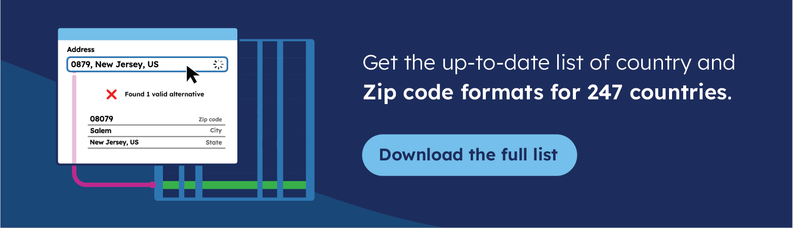
🌎 Use accurate data for mapping zip code data. For over 15 years, we have created the most comprehensive world zip code database, relying on more than 1,500 sources. Browse Geopostcodes datasets and download a free sample here.
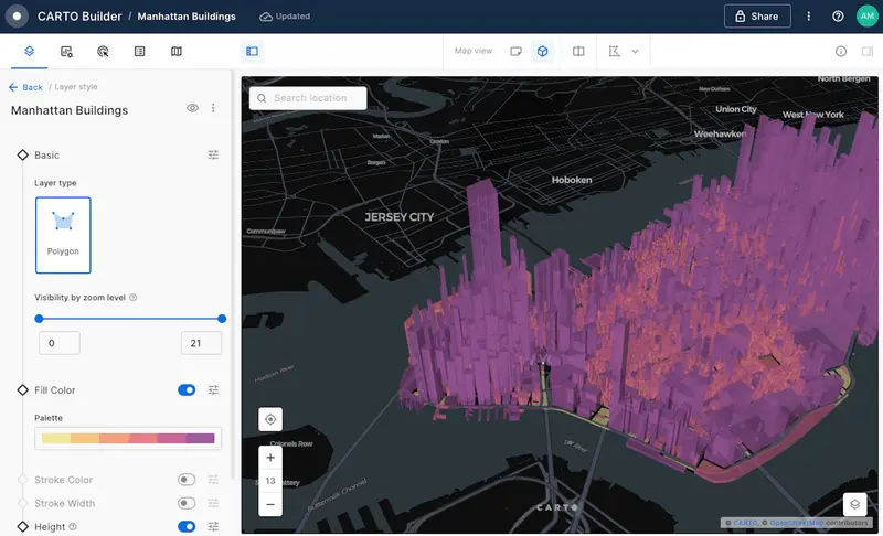
CARTO
CARTO is a fully cloud-native spatial analytics platform that excels in analyzing and visualizing large, complex datasets. It integrates advanced data science and spatial analytics in a user-friendly environment.
Key Use Cases
- Spatial Data Science: Leveraging geospatial data for advanced analytics.
- Big Data Analytics & Visualization: Handling and visualizing large datasets to extract actionable insights.
- Spatial App Development: Facilitating the development of custom spatial applications within the platform.
CARTO is particularly strong in its ability to provide a seamless experience across data analysis, visualization, and application development. It’s highly scalable, making it suitable for handling vast datasets with ease.
Ideal for: Organizations that require dynamic spatial analytics and visualization capabilities, including urban planning, environmental monitoring, and retail site selection.
| Tool | Type | Pros | Cons |
|---|---|---|---|
| CARTO | Cloud-based GIS | – Powerful spatial analytics – User-friendly, no-code options – Scalable cloud-native platform | – Subscription required for full features – Less effective offline |
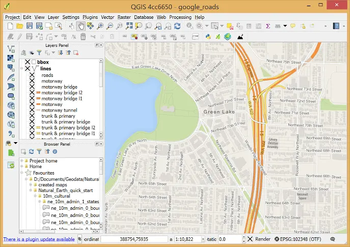
QGIS
QGIS is an open-source Geographic Information System that allows users to analyze and interpret spatial information on multiple platforms. It is known for its flexibility and extensive customization capabilities.
Key Use Cases
- Static Cartography: To create maps for print or digital use
- Data Creation and Editing: To facilitate the creation and modification of spatial data
QGIS’s open-source framework allows for extensive customization and integration with numerous plugins, which is a significant advantage for users needing specific functionalities tailored to their projects.
Ideal for: GIS professionals and researchers who need a robust, adaptable GIS tool without the high costs associated with commercial software. QGIS suits academic, environmental, and government sectors particularly well.
| Tool | Type | Pros | Cons |
|---|---|---|---|
| QGIS | Open-source GIS | – Highly customizable – Extensive plugin ecosystem – Free to use | – Steeper learning curve – Can be slow with large datasets |
Esri
Esri’s suite of tools, centered around the ArcGIS platform, provides comprehensive solutions for managing and analyzing geographical data. It supports a wide range of GIS applications, from simple map creation to complex spatial modeling.
Key Use Cases
- Enterprise GIS Deployment: Implementing GIS solutions at a large scale across an organization.
- Real-time Environmental Monitoring: Tracking environmental changes using spatial data.
- Urban Planning and Community Development: Facilitating planning and development activities with spatial analysis.
Esri is recognized for its ability to integrate complex spatial data into operational processes, supporting a broad spectrum of GIS applications with reliability and precision.
Ideal for: Large organizations, such as governmental bodies and multinational corporations, that require a reliable, scalable GIS for extensive spatial analysis and data management
| Tool | Type | Pros | Cons |
|---|---|---|---|
| Esri | Enterprise GIS software | – Comprehensive GIS capabilities – Scalable and integrated solutions – Strong industry presence | – Expensive – Complex for small projects |
Kepler.gl
Kepler.gl is a powerful, open-source geospatial analysis tool for creating sophisticated visualizations of large-scale datasets. Developed by Uber, it is designed to operate entirely in the browser, making it accessible and easy to use for a wide range of data visualization tasks.
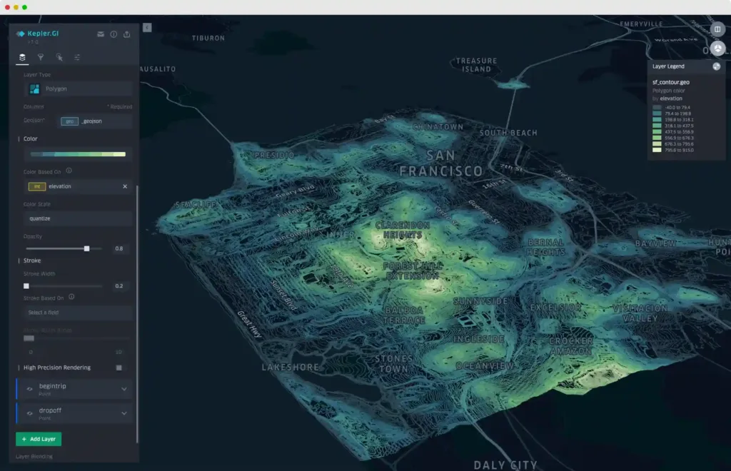
Key Use Cases
- Data Visualization: Specializes in rendering large-scale geospatial datasets interactively, making it suitable for exploring complex spatial patterns and relationships.
Kepler.gl‘s strength lies in its ability to provide immediate visual insights from massive datasets without any server-side dependencies, leveraging powerful client-side processing.
Ideal for: This tool is perfect for data analysts, scientists, and journalists who require robust, interactive visualizations to tell stories or derive insights from complex spatial data. It is particularly useful for projects involving mobility, urban planning, and environmental monitoring.
| Tool | Type | Pros | Cons |
|---|---|---|---|
| Kepler.gl | JavaScript library | – Excellent for large-scale data visualization – Open-source – Operates entirely in the browser | – Limited analytical capabilities – Requires web connectivity |
Mapbox
Mapbox is a dynamic mapping platform that offers developers extensive tools to create custom, interactive maps and location-based applications. It is renowned for its powerful APIs and SDKs, which allow for deep customization and integration into mobile and web applications.

Key Use Cases
- Custom Map Development: Building tailored maps that are highly interactive and visually appealing for web and mobile platforms.
- Real-time Location-based Services: Developing applications that require real-time mapping and geolocation capabilities.
Mapbox excels in its customization capabilities, allowing developers to fine-tune every aspect of their maps and data presentations. Its strong API support facilitates easy integration with a wide range of applications and data sources.
Ideal for: Mapbox is ideal for developers and organizations that need to integrate sophisticated mapping solutions into their applications, such as in logistics, real estate, and consumer services, where customizability and real-time data are crucial.
| Tool | Type | Pros | Cons |
|---|---|---|---|
| Mapbox | Location data platform | – Highly customizable maps – Strong API for developers – Suitable for real-time applications | – Costs can scale with usage – Requires developer skills |
MapInfo
MapInfo Pro by Precisely is a robust desktop GIS application that provides comprehensive tools for spatial data analysis, mapping, and visualization. It is designed to help businesses and analysts interpret the complex relationships between data and geography.
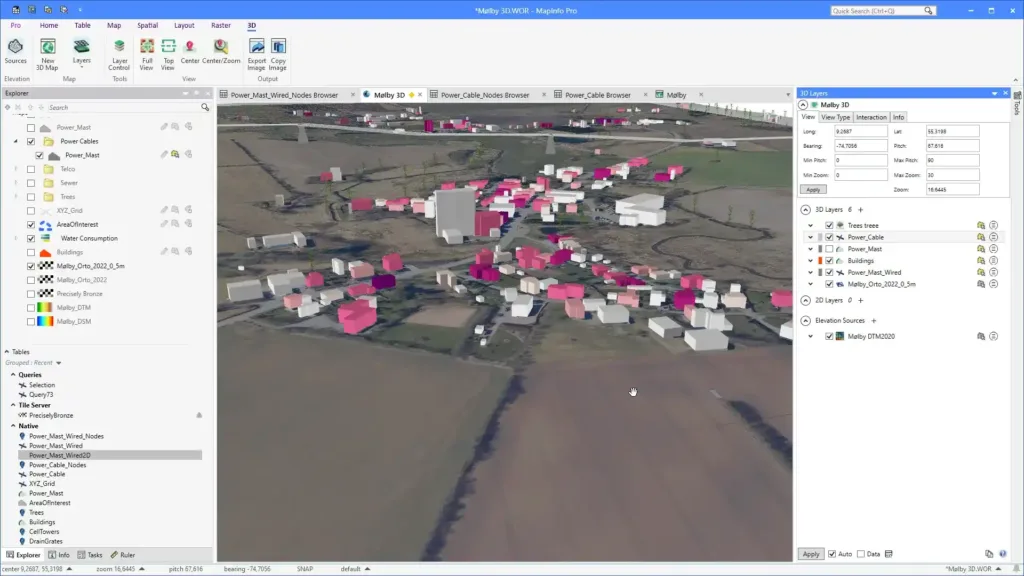
Key Use Cases
- Spatial Data Analysis and Visualization: Offers powerful tools for analyzing spatial data and generating insightful maps and reports.
- Market Analysis and Site Selection: Supports business decisions by providing spatial insights into market trends and demographics.
MapInfo Pro is noted for its precision and the ability to handle complex spatial queries and analysis. It integrates well with traditional business data, offering detailed geographic insights that support strategic decision-making.
Ideal for: This tool is perfect for business analysts, marketers, and planners in sectors like telecommunications, retail, and real estate, where detailed spatial analysis and decision-making based on geographic data are essential.
| Tool | Type | Pros | Cons |
|---|---|---|---|
| MapInfo | Desktop GIS software | – Powerful mapping and spatial analysis tools – Good for detailed cartography | – Dated interface – Expensive for personal use |
Felt
Felt is a collaborative mapping tool designed to facilitate real-time, shared spatial understanding among teams. Its intuitive platform allows for easy interactive map creation and sharing, making it suitable for a wide array of collaborative projects.
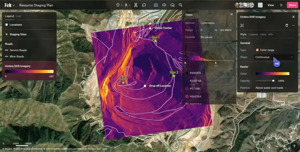
Key Use Cases
- Collaborative Mapping Projects: Enables multiple users to work together in real time, making it perfect for team-based mapping and spatial analysis projects.
- Community Planning and Engagement: The tool is used extensively for urban planning and community projects where stakeholder input and collaboration are crucial.
Felt’s main strength is its ability to integrate users from various backgrounds into the mapping process without requiring extensive technical knowledge, democratizing the use of GIS tools.
Ideal for: Urban planners, community organizers, and educators who need a collaborative and user-friendly tool to engage multiple stakeholders in spatial planning and decision-making processes.
| Tool | Type | Pros | Cons |
|---|---|---|---|
| Felt | Web-based mapping tool | – Real-time collaboration – Intuitive user interface – Web-based and accessible | – Limited GIS functionality – Internet-dependent |
Foursquare Studio/Unfolded
Foursquare Studio, previously known as Unfolded, offers advanced tools for data analysis and visualization focused on geospatial data, serving a growing community of developers and data scientists.
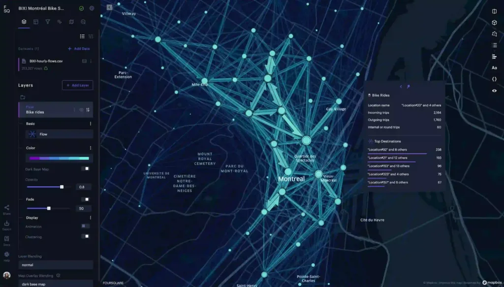
Key Use Cases
- Advanced Data Visualization: Provides sophisticated tools for visualizing complex geospatial datasets.
- Real-time Spatial Data Analysis: Enables the processing and analysis of spatial data in real-time.
Foursquare Studio excels in processing and visualizing large-scale spatial data in real-time, providing valuable insights with speed and precision.
Ideal for: Developers and data scientists who need a powerful platform for integrating complex spatial analysis and real-time data visualization into their workflows.
| Tool | Type | Pros | Cons |
|---|---|---|---|
| Foursquare Studio | Geospatial platform | – Real-time data analysis – Focused on developer needs – Handles large datasets efficiently | – Requires technical expertise – Not as intuitive for beginners |
Tableau
Tableau is a premier business intelligence and data visualization tool that excels at creating interactive and visually compelling insights. It integrates spatial data seamlessly into dashboards, enhancing the overall storytelling with data.
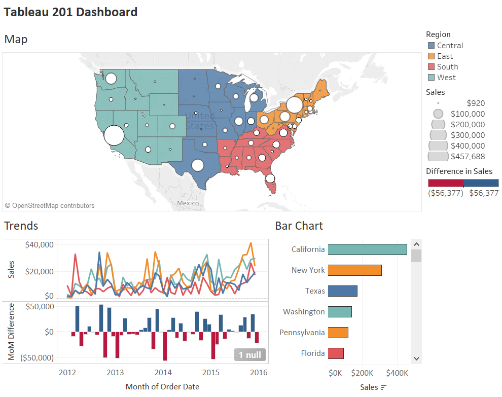
Key Use Cases
- Business Intelligence: Enhances business decision-making through interactive dashboards.
- Spatial Data Visualization: Integrates geographic information to provide spatial context to business data.
Tableau’s user-friendly interface and robust visualization capabilities make it a leader in the business intelligence sector, enabling non-technical users to create and understand complex data visualizations easily.
Ideal for: Business professionals and analysts across various industries who need to incorporate spatial analysis into their data visualization and business intelligence efforts.
| Tool | Type | Pros | Cons |
|---|---|---|---|
| Tableau | Business intelligence | – Powerful visualization capabilities – Easy to integrate spatial data – Widely used in various industries | – Can be expensive – Steep learning curve for advanced features |
Power BI
Power BI is a business analytics tool by Microsoft that enables users to visualize and share insights from their data. It offers robust spatial analytics capabilities through its integration with Azure Maps and other geographic data sources. Power BI allows users to create interactive maps, perform spatial analysis, and incorporate location intelligence into their reports and dashboards seamlessly.
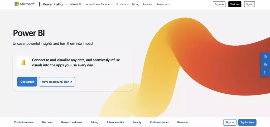
Key Use Cases
- Business Intelligence: Enhancing decision-making through interactive dashboards and reports.
- Spatial Data Visualization: Integrating geographic information to provide spatial context to business data.
- Location Intelligence: Analyzing spatial data to uncover trends, patterns, and insights related to geographic locations.
Ideal for: Businesses and analysts seeking to leverage spatial data for data-driven decision-making within the familiar Microsoft ecosystem.
| Tool | Type | Pros | Cons |
|---|---|---|---|
| Power BI | Cloud-based | – Affordability – Custom Visualizations – Excel Integration | – Performance issues with large datasets – Rigid Formulas |
Alteryx
Alteryx is a self-service data analytics platform that empowers users to prep, blend, and analyze data from various sources, including spatial data. It offers geospatial analytics tools for spatial data processing, enrichment, and analysis, enabling users to derive actionable insights from geographic information.

Key Use Cases
- Data Preparation and Blending: Preparing and integrating spatial data with other data sources for analysis
- Spatial Analysis: Conducting advanced spatial analytics, including proximity analysis, spatial clustering, and spatial interpolation
- Geospatial Enrichment: Enhancing spatial data with additional context, such as demographic or business data, for deeper insights
Ideal for: Data analysts and scientists looking for a comprehensive platform to handle spatial data alongside other data types, streamlining the entire analytics workflow from data preparation to advanced spatial analysis.
| Tool | Type | Pros | Cons |
|---|---|---|---|
| Alteryx | Self-service analytics | – Comprehensive GIS capabilities – Extensive data preparation tools – Scalable and integrated solutions | – Can be expensive – Steep learning curve – Can be complex for beginners |
How can I find accurate location data to create my own custom map?
With more than ten years of experience in zip code data processing, we offer the most comprehensive, accurate, and up-to-date geocoded zip code data. This is something that cannot be guaranteed by built-in geocoding services offered by ArcGIS, QGIS, Carto, and Mapbox, which do not own data that is reliable enough. Browse Geopostcodes datasets and download a free sample here.
No matter which tool best serves your use case, your analysis will only be as good as the quality of your data. Making sure you use accurate geocoded zip codes for your analysis is as important as choosing the right tool.
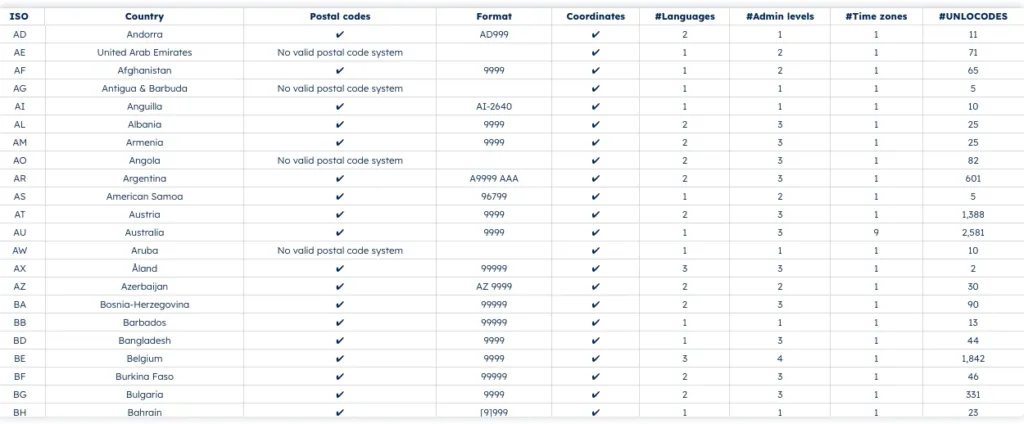
Since zip code data can change frequently, you want to be sure that you use an accurate and current source. You also want to make sure that your data has the coverage needed for your use case. If your business has an international footprint, using data from several sources can result in gaps and inaccuracies.
If you’re not sure about the quality of your data, reach out to us. If you’d like to learn how to do the geocoding yourself, check out our tutorial.
FAQ
What is the mapping tool for zip codes?
A mapping tool for zip codes allows users to visualize and analyze geographical data based on zip codes.
Popular options include BatchGeo, which allows you to create maps from spreadsheet data, and Mapline, known for its advanced features like heat mapping and territory creation.
Maptive also provides powerful tools for visualizing data by zip code and creating custom maps with extensive customization options.
These tools help businesses visualize geographic data, create sales territories, and analyze market trends effectively.
Is there a way to plot zip codes on a map?
Yes, plotting zip codes on a map is straightforward with the right tools.
Tools like Mapline and BatchGeo allow users to upload data from spreadsheets and instantly plot zip codes on interactive maps.
These platforms offer features such as custom pin placements, territory definitions, and demographic overlays, making it easy to visualize and analyze data geographically.
Can Excel do a ZIP code map?
Excel alone cannot create a zip code map, but you can use it in conjunction with mapping tools.
For instance, you can prepare your data in Excel and then upload it to a platform like BatchGeo or Mapline, which will generate a map based on your zip code data.
These tools integrate seamlessly with Excel, allowing you to visualize and analyze your data efficiently.
How to map zip codes in Google Maps?
To map zip codes in Google Maps, you can use tools like Mapline or Maptive that integrate with Google Maps. These tools allow you to upload your zip code data and create custom maps with Google’s interface.
Alternatively, you can use Google’s My Maps feature by manually entering zip codes or importing a CSV file with your zip code data.
This approach provides a simple way to visualize zip codes on Google Maps, although it may lack the advanced features of dedicated mapping software.
How can I use a zip code boundary map?
You can use it for demographic analysis, marketing strategies, logistics planning, and navigation.
What are zip code labels?
Zip code labels are adhesive labels used for organizing, sorting, and identifying items by their zip codes.
How can I find accurate zip code boundaries?
Zip code boundaries are crucial for demographic analysis, logistics planning, and market research. GeoPostcodes offers you the most accurate boundaries available.
How often is census data collected?
In many countries, including the United States, census data is collected every ten years.