
Key takeaways
- Tableau enables zip code mapping using built-in geographic data or custom imported polygons.
- Built-in Tableau geographic data covers limited countries with occasional accuracy and currency issues.
- Importing custom polygons gives complete control over map data quality and coverage.
- Step-by-step examples demonstrate both mapping approaches for business intelligence visualization needs.
Introduction
Tableau is a popular Business Intelligence tool trusted by organizations for dashboard creation. Its advantages include ease of use, shareable results, and compatibility with diverse data formats.
Though not originally for geographic data, it now offers mapping capabilities for monitoring performance by area, identifying growth zones, or reassessing territory divisions. Zip codes provide convenient mapping, easily linking to address data while offering aggregated views for analysis.
This article shows two ways to create zip maps in Tableau: using integrated geographic sources or importing custom polygons for complete control. Step-by-step examples illustrate both approaches.
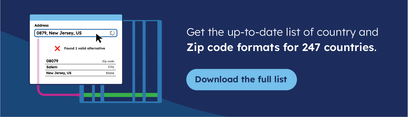
💡 Use accurate data to create a zip code map. We offer the most comprehensive and up-to-date international zip code data for enterprises. Browse GeoPostcodes datasets for free and download a sample here.
Using Tableau-embedded geographic data sources
Tableau includes, by default, geographic sources from several providers (including Mapbox, OpenStreetMap, and Geonames).
Similarly to PowerBI, Tableau matches data fields to pre-defined internal levels named Country/Region, State/Province, County, and City. In addition, it conveniently allows for mapping through widespread international geocode systems such as FIPS, ISO3166-1, and NUTS. For the USA, possibilities are extended to phone area codes, congressional districts, and CBSA/MSA (Core-Based Statistical Areas). Finally, Tableau can link to airport codes (IATA and ICAO).
The most important for this article is that Tableau also provides zip code mapping for 56 countries.
The list of available Map layers for each country/ is available here.
Tableau also offers functionality to manually match locations that would not be automatically linked to embedded data, for instance, in case of spelling differences or ambiguities (several entities sharing the same name or zip code may not be formatted the same way).
Finally, you can create groups of objects. Zips are frequently following a hierarchical model. So, you can create groups by zip prefixes if you want to aggregate your data at a higher level.
Step-by-step example: total income per zip code in Florida
Let’s see how we can create a map of the total income per zip in Florida. You can download the data from GeoPostcodes’ Github directory. It contains an extract of the 2020 tax report data published by the US IRS, providing the total income per postal code in 2020.
Follow these steps to build your map of income per zip in Florida:
1. To start, open Tableau and create a New dashboard. Then click on “Text File” (1) -> and select the file you have just downloaded (2).
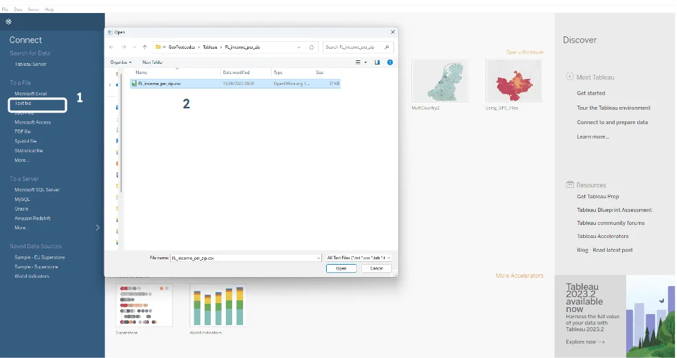
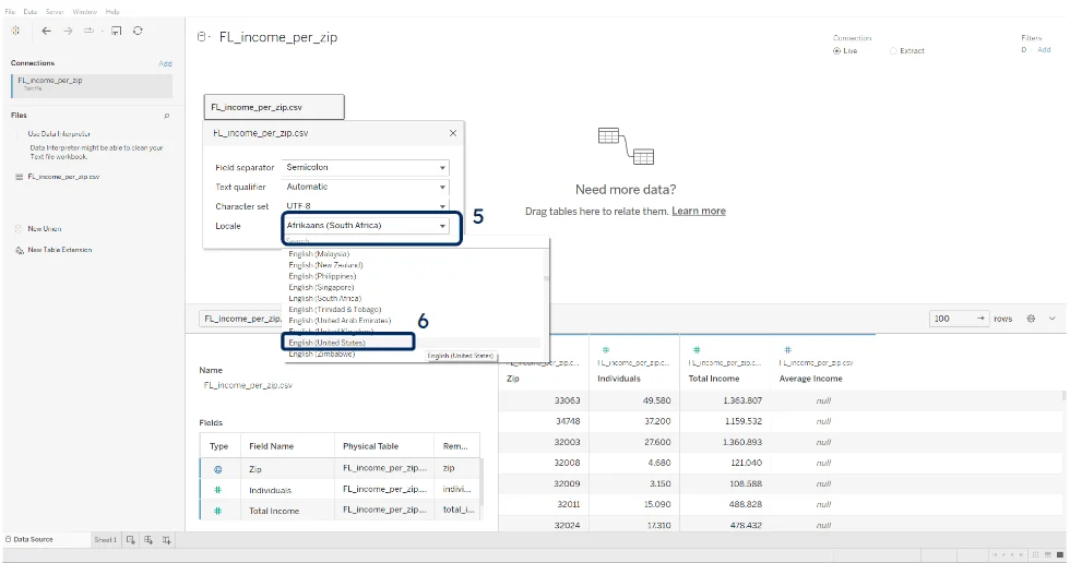
2. From the data sources panel, first, make sure the file has been opened with the correct encoding: click on the arrow next to the file name (3), then on “Text File Properties” (4). In the “Locale” (5) property, select “English (United States)” (6).
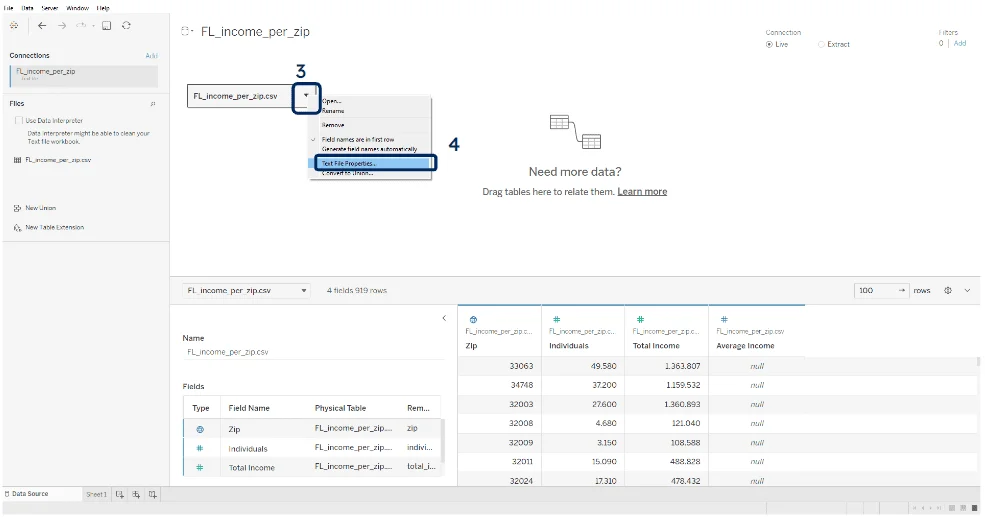
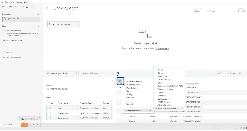
3. Ensure the Zip field has the Zip Geographic role: Click on the icon on top of the zip column (7) and select “ZIP Code/Postcode” as Geographic Role.
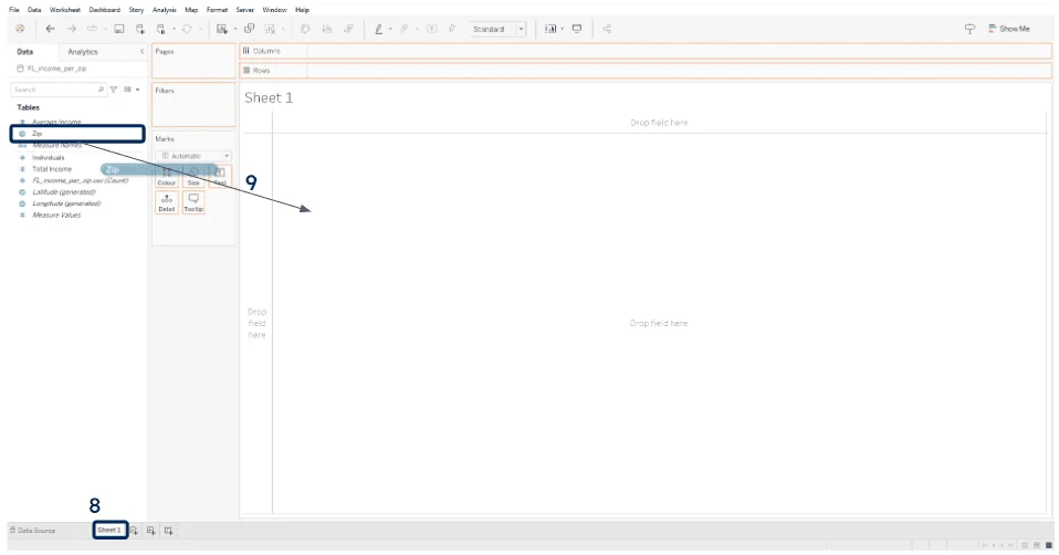
4. Go to your Worksheet (8), drag and drop the “Zip” field (9) into the center of the worksheet (“Drop field here”).
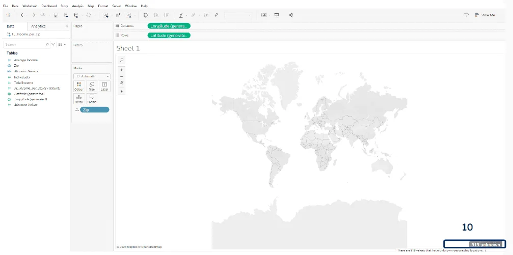
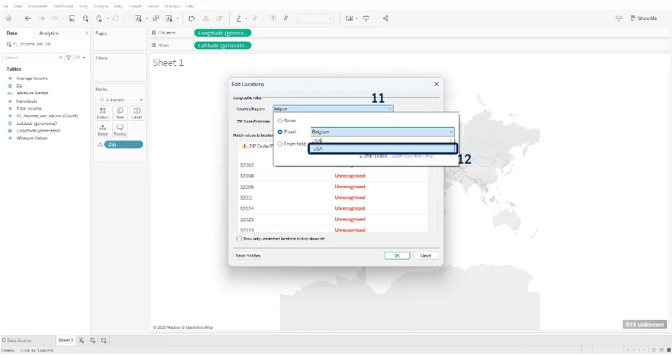
5. If the Zips are not automatically recognized, click on “… unknown” at the bottom right (10), then “Edit Locations” and make sure the “Country/Region” field (11) is set to the USA (12).
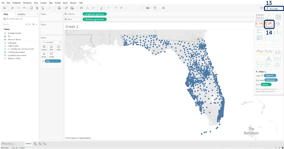
6. You should now see the US states with points inside them. To switch to a choropleth (colored polygons) view, click on “Show Me” (13) and select the “Map” type (14).
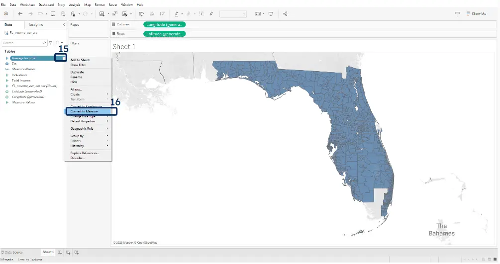
7. Convert the “Average Income” field to a measure: click on the arrow on its right (15) and select “Convert to measure” (16).
8. Now drag the “Average Income” field to the “Colour” icon (17).
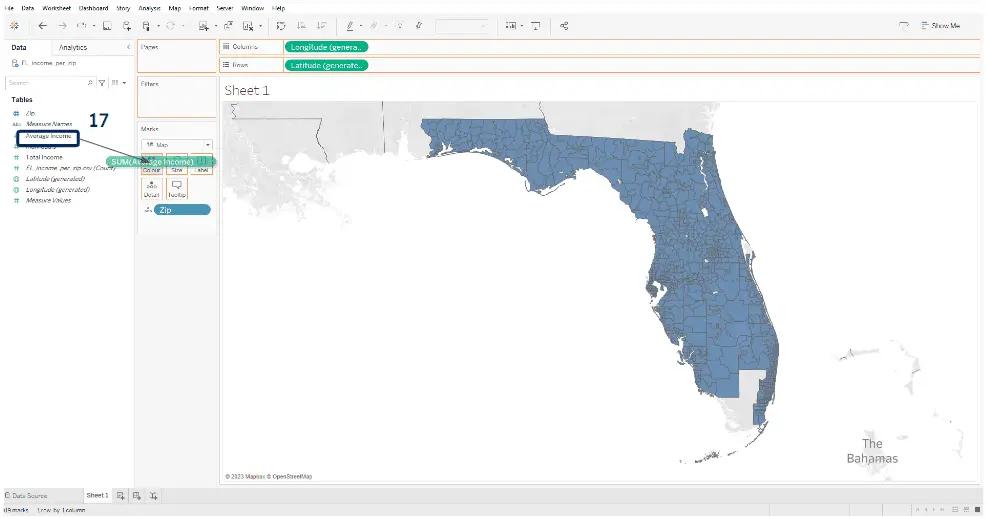
9. There it is. You have built your map of total income per zip code in Florida. Note that the IRS does not report values for Zip codes with less than 100 returners, while there are a couple of empty zones on the map.
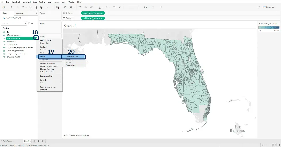
10. The map’s contrast is not great so far because of the distribution of average incomes (a few outliers with high values, but the vast majority of incomes are within a lower range). To change that, we can color according to the logarithm of the average incomes. Click on the arrow next to “Average Income” (18), then “Create” (19) and “Calculated field” (20).
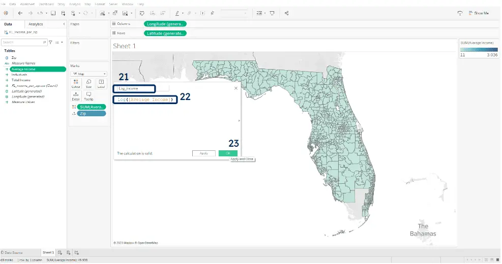
11. Rename the field to “Log_income” (21) and enter “Log([Average Income])” as formula (22), then click on ok (23).
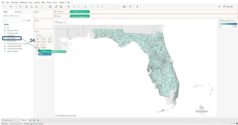
12. Drag the “Log_income” field over the “SUM[Average Income]” to replace the coloring variable (24).
13. To improve the displayed tooltip when you hover over the zip areas, drag the “Average Income” field to the “Tooltip” icon (25).
14. Click on the Tooltip icon (26), remove the line for log incomes (27), and, because amounts from the IRS field are in thousands of dollars, add “,000$” after the Average income variable (27).
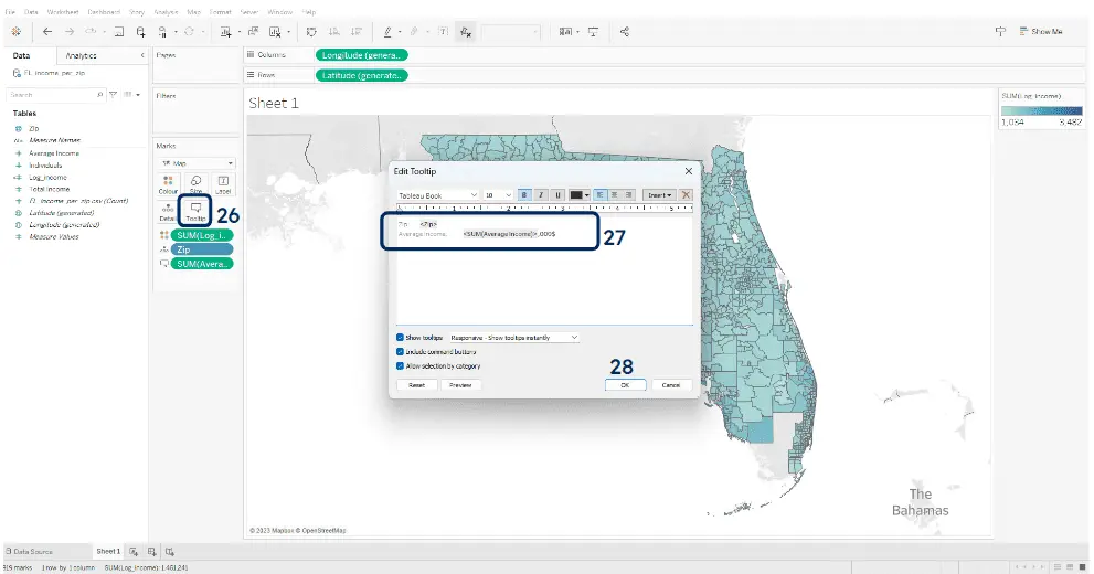
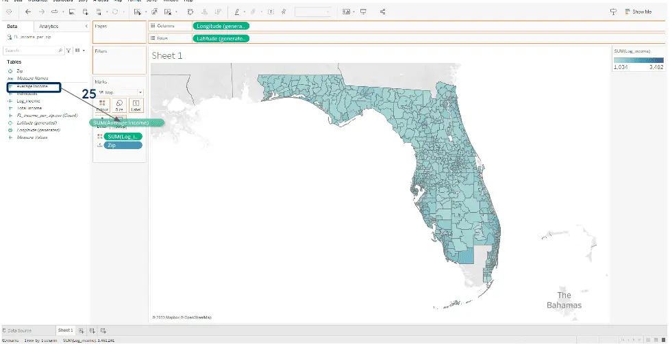
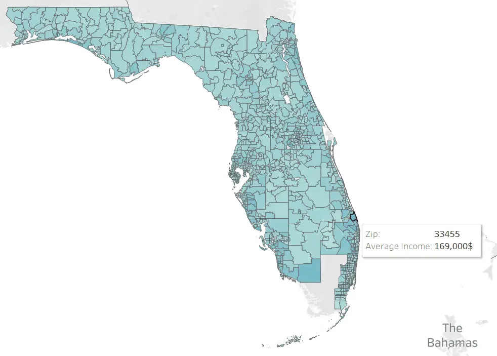
15. Your map is ready now, with a bit more contrast thanks to the logarithmic coloring and a nice tooltip to show you the average incomes per zip when you hover each polygon.
As you can see, it was extremely easy to create that map, just using the tabular data (2 fields: ZIP and average income) we had downloaded and leveraging Tableau’s embedded geographical data. Unfortunately, setting up your dashboards is not always easy when you want to map data from different countries or at other aggregation levels. Let’s now talk a bit about the challenges you will face.
The challenges with Tableau’s embedded polygons
The main difficulties in using the embedded geographic data in Tableau relate to coverage, quality, and lack of control. Here are a few more details, both on the general cases of leveraging geographic mapping directly from Tableau (for administrative divisions or ZIPs) and the specific cases of Zip code mapping:
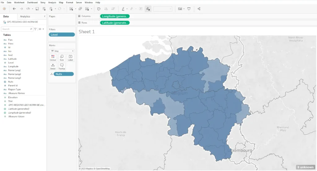
- Quality: in several countries, the administrative boundaries are not up-to-date. For example, in Belgium, there is level 3 encoding through the NUTS codes, but these don’t include the changes from 2019. This is shown in Figure Y, where the level 3 subdivisions appear in dark blue, and the missing areas in light blue (Belgium is covered entirely by level 3 subdivisions, but Tableau misses some, as indicated by the 8 “unknown” regions).
For Algeria, Provinces still refer to the 48 Provinces existing before 2019. Since then, there have been 58 Provinces in Algeria, but they are not all available through Tableau. Similarly, in Latvia, Tableau is still referring to the divisions before the administrative reorganization which entered into force in July 2021 (moving from 110 to 43 cities).
For Sweden, Tableau reports 10.006 postal codes available. This is over 500 postal codes short of the country/’s total number of active postal codes. That means 5% of the postal codes you will not be able to display through Tableau, and there are some wrong shapes for the existing ones.
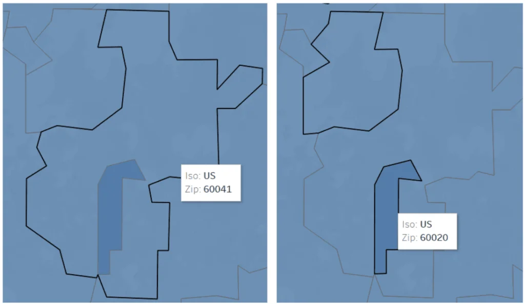
Furthermore, the (simplified) polygons are not perfectly aligned, as shown in the following figure, where 2 US zip codes overlap in one area.
Simplifying shapes makes sense for Tableau’s typical use cases: high-level maps showing many polygons across large areas. Detailed polygon features would be unnecessary and often invisible at these scales. However, gaps and overlaps between simplified polygons not only reduce map aesthetics but can cause analysis confusion and errors. You can learn how to build an accurate postal code polygon database here.
- Coverage: Postal code boundaries exist for only 56 countries. Administrative boundaries often lack lower hierarchy levels. France stops at level 2 (departments), missing arrondissements and municipalities. Belgium includes arrondissements but not municipalities. Italy offers just 107 Provinces, lacking more detailed administrative data. For Belgium, Tableau’s PLACES feature only contains larger towns, omitting smaller localities and villages.
- Disambiguation work: Places and administrative divisions often share names with other entities. The USA has 30 counties and 1 Parish named “Washington.” Over half of US states have subdivisions named after George Washington. When importing county data, Tableau can’t determine which specific County you mean. It marks locations as “unknown” until you specify the administrative hierarchy. This requires having hierarchy data linked to your original dataset. Similar issues occur with postal codes. Though unique per country/ (except one case in Cambodia, which Tableau doesn’t cover), postal codes from different countries may share values. Always include a country/ field in your data.
- Lack of control: You can’t see what happens behind the scenes. What’s available? Where’s it from? Is it accurate and current? What if you need custom groupings? When will underlying data update next? Data updates may break dashboards until you include new keys (like new Provinces).
- Expertise needed: as you don’t control what’s available in Tableau, and as it may not be accurate or up-to-date, you can’t know if what you see are reliable polygons unless you have expertise in the domain. Getting help and even more fixes if you’re questioning the served data is not straightforward.
For all those reasons, taking control of the used data is desirable. So you know exactly what is in it (and what’s not) and update it when you can, want, or have to. Luckily, Tableau offers possibilities to use other geographical data sources. Let’s now explore how custom geographical files can be imported into Tableau.
How to import custom zip code polygons into Tableau
Available file formats
Tableau can ingest several geographical data formats: Shapefile, geoJSON, KML, MapInfo, topojson. Note, however, that it can’t read the “ExtendedData” out of KML files at the time of writing, which hinders linking KML files to other data in the application: you can only leverage the ID field as a key.
Linking to other data
Linking geographical data to other sources is extremely easy as Tableau offers a relationship/join interface allowing users to choose which keys should be related to the joined files. Tableau can even perform joins through geographical data (linking datasets based on the relationship between their geometries).
Step-by-step example: showing the Population per postal code in South Korea
In this second example, we will join two files: a geographic file that includes the polygons of the postal codes in Sejong City and a CSV file that gives the population per postal code.
1. Download all the data from our Github repository. It contains the simplified postal boundaries for Busanjin County (GPC-BNDR-PST-VIZ-Busanjin.*) and the population per zip code (KR_Busanjin_pop_per_zip.csv).
2. Upload the 2 files to Tableau. Start a new project and connect to a new data source. Select “spatial file” and then browse your hard drive to select the .shp file you downloaded. Next, click “Add,” select “Text file” and point to the population CSV. Then, drag the “KR_Busanjin_pop_per_zip.csv” file from the left menu towards the right pane (1).
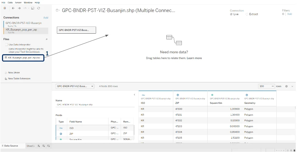
3. Ensure the zip columns in both files are string data types (2 and 3 for the CSV file). Additionally, check the geographical roles for the Zips (and all fields except the geometry) are set to “None” (4).
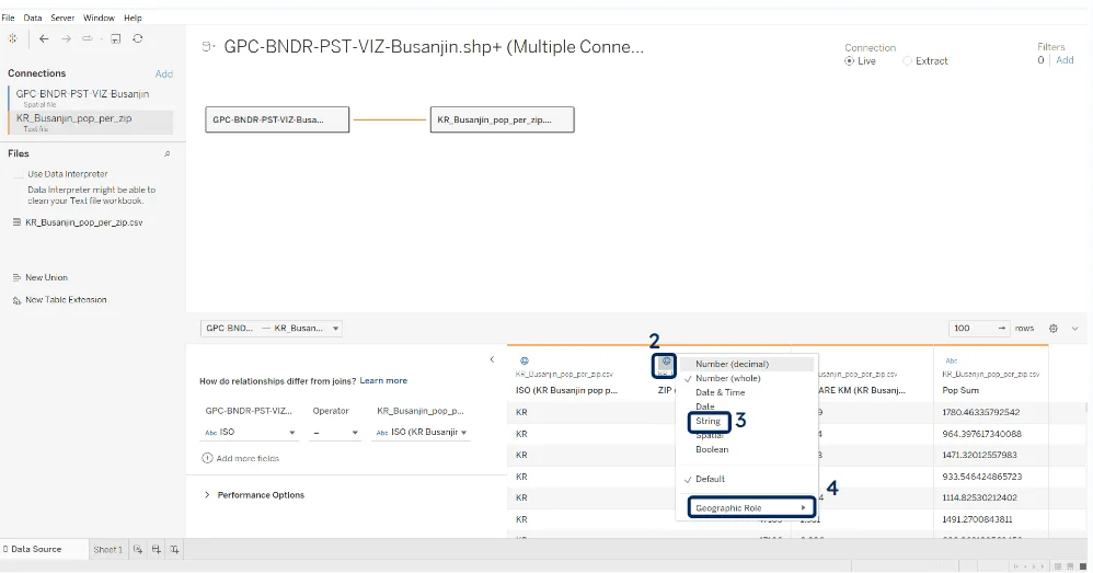
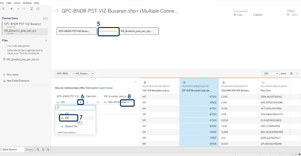
4. Establish the relationship between the 2 data sources. Click on the link between them (5), then select the key for the first file (6) and choose “ZIP” (7). Repeat the operation for the second file (8), choosing zip, so your relationship reads “ZIP = ZIP.”
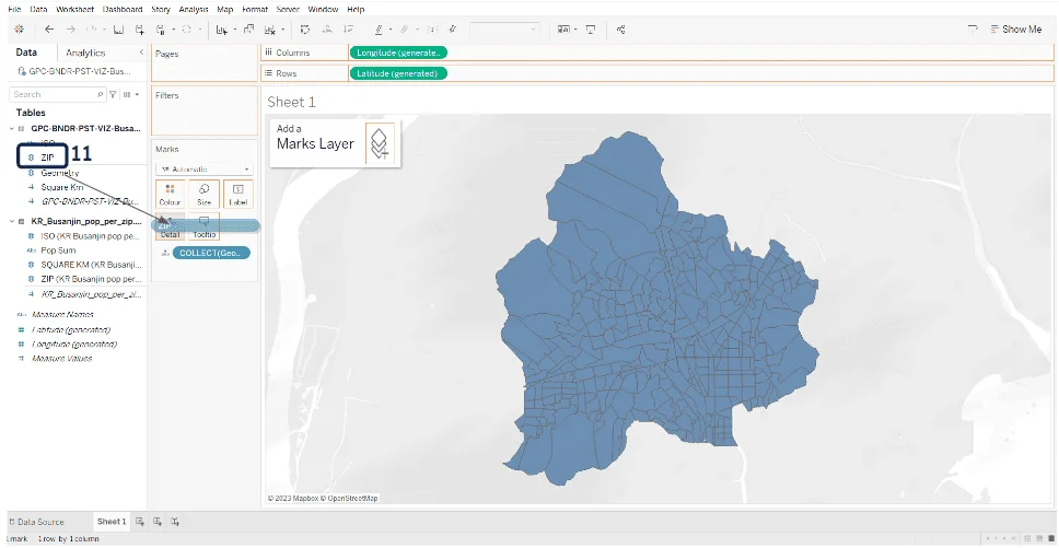
5. Access your worksheet (Click “Sheet 1”, 9). Drag the Geometry field to the center of the worksheet (10).
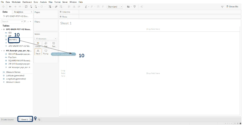
6. Drag the “ZIP” field to the “Details” icon (11).
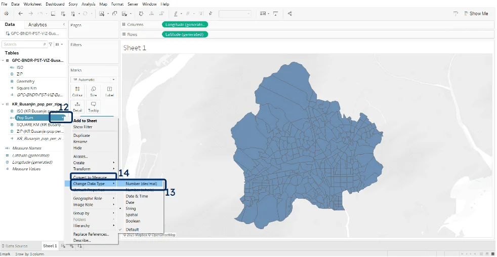
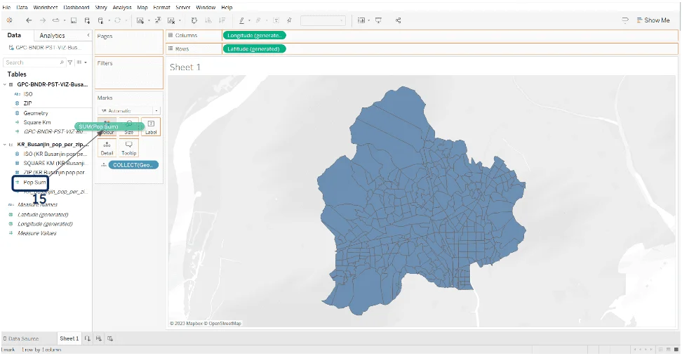
7. Convert the Pop sum to a decimal number (12-13) and a measure (14), then drag it on the color icon (15).
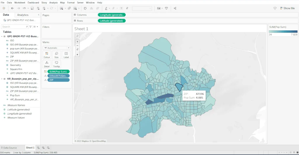
8. You now have your choropleth map of population per postal code, combining the CSV data with the polygons you have imported through the shape file.
Conclusion
This article showed how easily you can create zip-based choropleth maps in Tableau.
First, we used embedded Tableau polygons and noted their limitations. Available data has imperfections affecting projects unless you accept limited country/ coverage and possibly outdated information. Lack of control remains the biggest issue.
Next, we explored importing geographic files into Tableau. Tableau accepts popular file formats and gives full control over joins. This works internationally, despite our simplified examples. You just need consistent input data.
All you need is consistent input data. However, remember Tableau remains a BI tool with display limits. Use aggregations or filters when dashboards slow down. While Tableau excels in many areas, other tools better suit territory mapping.
If importing geographic data appeals to you, you may seek trustworthy geographical data sources.
GeoPostcodes maintains the most accurate postal database in the world. Our products include postal and administrative boundaries for all countries. Thanks to the internal use of a topological model, we also deliver simplified versions of the polygons, still perfectly matching, like the sample you downloaded for the second exercise.
These are ideal for Tableau choropleth maps. Download our files, explore them, edit if needed, upload to Tableau, and create insightful maps. You control when to update geometries. We will be happy to assist you in finding the best option for your business, so don’t hesitate to reach out.
FAQ
Can Tableau map zip codes?
Yes, Tableau map zip code functionality lets users visualize regions using built-in geographic roles, making it easy to create, customize, and export maps for insightful spatial analysis.
How to plot ZIP Code on a map?
To create a map visualization in Tableau, drag a geographic dimension (e.g., Country, State, City) to the Rows or Columns shelf and a measure (e.g., Sales, Population) to the Marks card. Tableau will automatically recognize the data as geographic and display a map.
Can I make a map in Tableau with addresses?
Yes, you can create a Tableau map with addresses using zip code data to build regions and export the map as a solution for location-based analysis.
How to use postcodes in Tableau?
Use the zip code geographic role in Tableau to map regions accurately, create a visual solution, and export the results for reporting or sharing.
Does Tableau map zip codes?
Tableau map zip code functionality lets users create regions, making it a powerful solution for spatial analysis that can be exported for further use.