
Power BI is a powerful tool for creating Business Intelligence dashboards. It can import data from various sources, from files to databases. Among the elements you can include in your dashboards are maps.
This comes particularly handy to visualize your performance, capacity, or potential per region or review your territory mapping, for instance.
In this article, we will see how you can create maps in your Power BI dashboards. We will start with the possibilities the connection between Power BI and Bing maps offers. This enables you to build maps of fields representing geographical entities such as States, Provinces, or Cities.
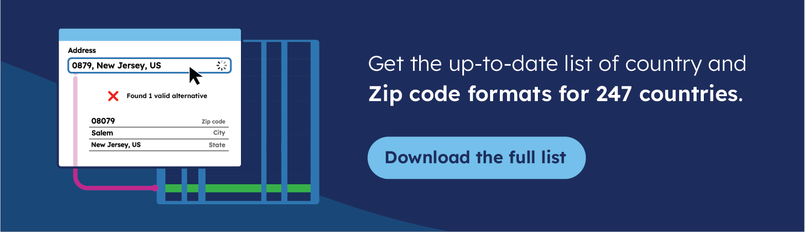
💡 Use accurate data to create a zip code map. We offer the most comprehensive and up-to-date international zip code data for enterprises. Browse GeoPostcodes datasets for free and download a sample here.
We will then analyze the limitations of that automated mapping: coverage, quality, user-friendliness, and control. To overcome them, we will finally see how you can import custom polygons in Power BI. Step-by-step examples will illustrate all the points.
If you’re looking to discover more ways to leverage ZIP code data for enhanced business insights and efficiency, explore how to add geocoded ZIP codes to Salesforce, ensure accuracy with address validation in Microsoft Dynamics 365, create impactful visuals by mapping ZIP codes in Tableau, and optimize logistics by calculating distances between ZIP codes using Python.
Leveraging the connection with Bing Maps
Power BI can handle different data types and categories. Most categories refer to a geographical entity (address, place, city, county, state or province, postal code, country/, continent).
When a data field is labeled as one of those categories, Power BI queries Bing Maps (which relies on TomTom) to retrieve its associated coordinates.
There are essentially 2 types of Maps you can build that way with Power BI: punctual data (”Map” feature of Power BI) and polygons (”Filled Map” feature of Power BI, corresponding to what is technically referred to as a choropleth map).
We will focus on the latter throughout this article.
Let’s illustrate that by showing the population per state in the USA. Follow these steps to set it up:
Step 1: Download the population per state data from Census.gov.
Step 2: In a new Power BI project, Select “Get Data -> Text/CSV” and point to the file you have just downloaded
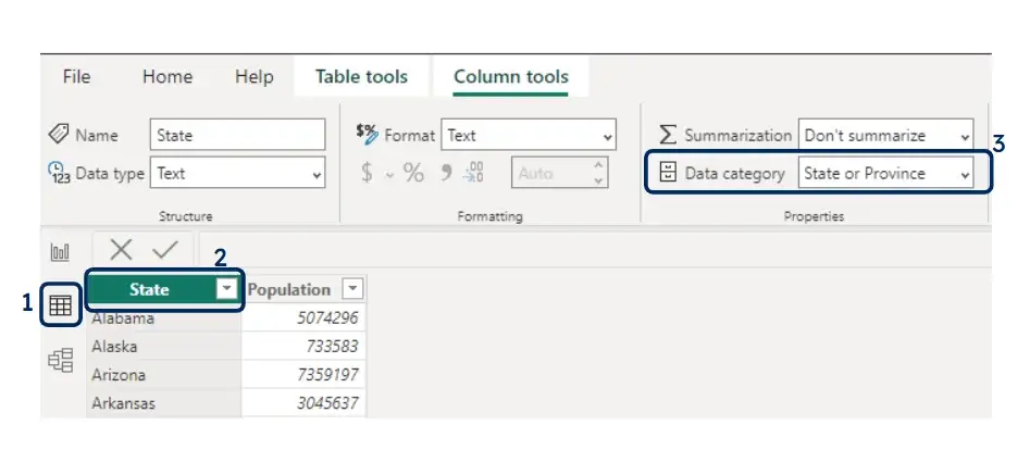
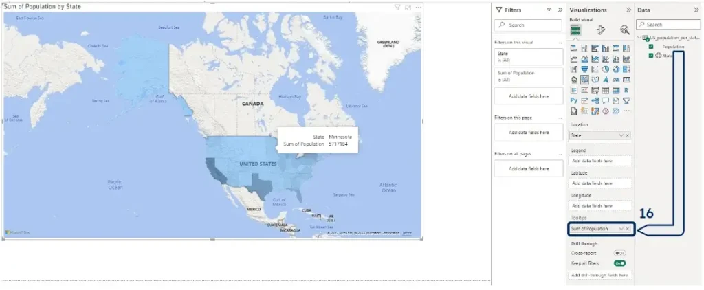
Step 3: Open the data view tab (1), select the “States” field (2), and modify its data category to “State or Province” (3)
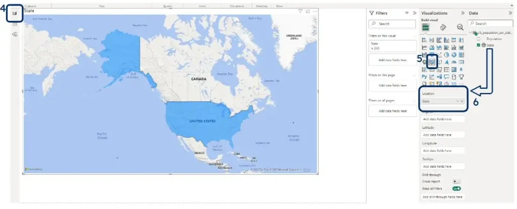
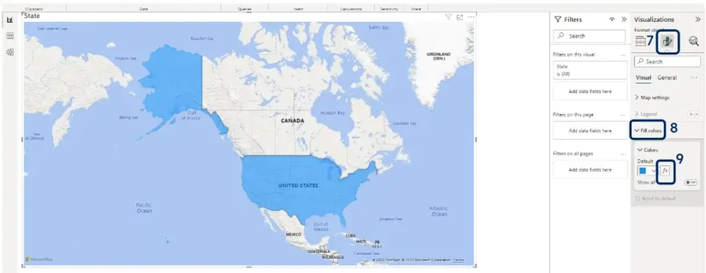
Step 4: Go back to the report view (4), select the “Filled Map” visualization (5), and drag your “State” column to the “Location” well (6)
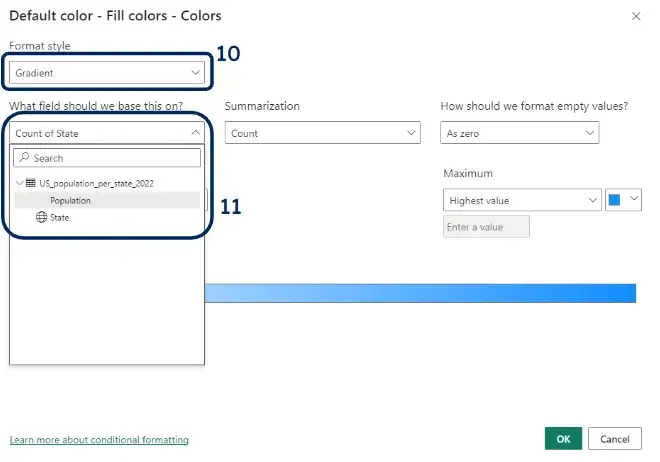
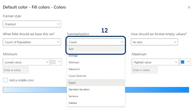
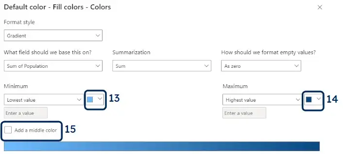
Step 5: Click on the “Format your visual” menu (7), then expand the “Fill colors” tab (8) and click on the “fx” icon (9). Choose “gradient” in format style and “Population” under “What field should we base this on?” and finally “Sum” as “Summarization”. You can also play with the Lowest (13) and Highest (14) Value colors, and add a middle color (15), if you want.
Step 6: After clicking “ok” to close the Default Colours tab, dropping the population to the tooltip dwell (16), and choosing “Sum” as the aggregation method for the tooltip, your map should now look like the following one, displaying the State and population number when you hover any state.
Common Challenges Encountered in Power BI Zip Code Mapping
The limitations of the embedded polygons in Power BI
Although at first sight this looks promising, and you may even find exactly what you need off the shelf, the approach suffers from several limitations:
Obscurity: no list exists explaining which geographic levels are (or are not) available from Bing Maps. You need to discover it by yourself by trying and looking at the results.
For instance, postal boundary polygons exist for the USA, Spain, and Belgium but not for Argentina. Furthermore, Power BI uses its own unified terminology to denote the administrative divisions (State or Province, County, Place), and it’s not straightforward to understand which official level has been mapped to those Bing levels.
For example, Spanish Provinces are mapped to “Counties” in Power BI, not “State or Province.” You will hence have to explore several combinations to determine whether Power BI does or does not provide the geographical data you are looking for.
Connection: stating the obvious, as Power BI queries Bing Maps to retrieve location information, this only works when you have an internet connection. You can’t work on your maps offline if they rely on the relationship with Bing.
Confusions: several places, administrative divisions, or postal codes can have the same name or values in different parts of the world. For names, there can even be several instances within the same country/ (for instance, there are 7 towns named “Boston” in the USA).
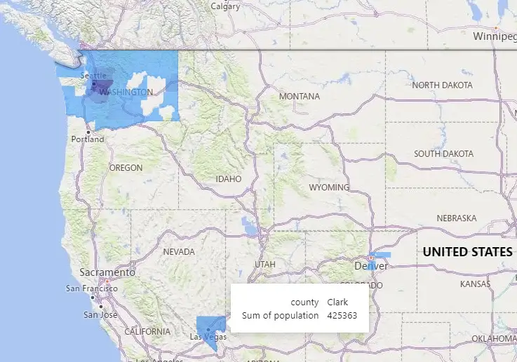
You will hence have to encode some form of hierarchy to help Bing narrow down its search to the target locations. This is illustrated in the figure below, which is meant to display the population per county in Washington state, USA.
If we only use the counties as geographical key, Bing Maps use the homonyms from other regions of the world for certain counties (for example, “Clark” county shows the county with the same name in Nevada, while “Lincoln” even points to its homonym in Great Britain).
You need to encode the geographical hierarchy (country/, state, county) for Bing Maps to retrieve the correct polygons.
This can prove complicated and at least diminishes the solution’s user-friendliness: you can’t just plug your source address data in and see it appear on the Power BI map; you have to tweak the mapping to create a useful map. Note that an alternative solution to help Bing identify your targets is to provide their coordinates.
But if you have all the coordinates, you better directly leverage them through custom maps (following the steps explained later in this article), without invoking Bing.
Slowliness: pinging Bing servers to geocode every point in your data is time-consuming. Likely, Power BI will rapidly become unresponsive, leading to frustrating idle periods before being able to resume your work. Power BI also offers an alternative to Filled Maps, called Shape Maps, in preview mode.
You need to use this map to import custom maps (see in the next chapter). It also includes the top administrative level for 12 countries (Australia, Austria, Brazil, Canada, France, Germany, Ireland, Italy, Mexico, Netherlands, United Kingdom, United States). In that case, Bing is not queried.
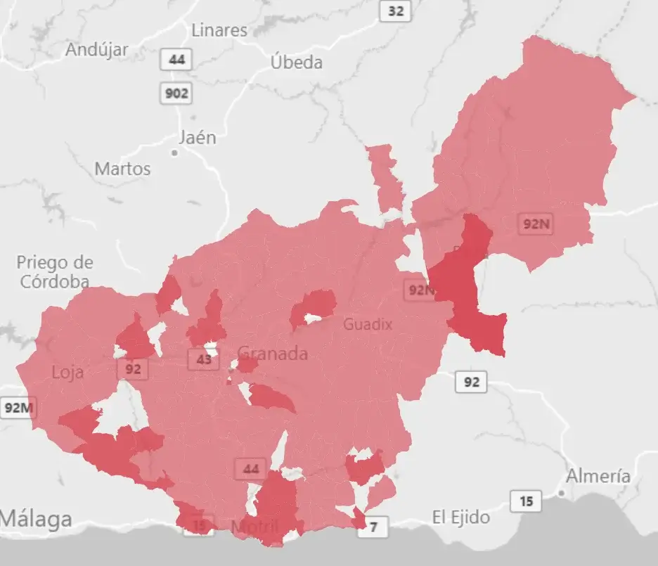
Variable quality: even when a layer is available in Power BI, it may be poor quality. For instance, postal boundaries are available for Spain, but as shown in the figure below, there are many holes and overlaps in the Granada Province.
Unfortunately, we have faced similar issues when building choropleth maps based on postal polygons in many areas we have explored (e.g., New York, Belgium), etc.
Lack of control: even if you manage to set up your custom map, initially, you will probably face issues down the road as you have no control over the geographical source.
If Bing changes its data, it may break your dashboard. You will be forced to work with outdated geographic areas if it does not. If you have new data points, you have no guarantee that Power BI will properly capture them.
And if you’re not happy with some polygons rendered by Power BI (because they are outdated or maybe because you would like to introduce some custom groupings to reflect your own operations), you just can’t do anything about it.
Limitations in number of rows: Shape Maps are limited to 1,500 datapoints, Maps 3,500, and Filled Maps 1,000. Azure Maps has a maximum of 30,000 data points.
Beyond those limits, you must divide and conquer: create different dashboards/views for high-level insights (e.g., country/, states) and granular analyses (e.g., counties or zips within one state). This is possible thanks to the geo-hierarchy feature explained below.
Unknown cost. Geocoding through the Power BI service is free for the moment, but it looks like that will change with Azure Maps, and it could become quite expensive (4,5$ for 1,000 geocoding requests)
Expertise needed: as explained above, the data pulled from Bing Maps is sometimes erroneous or inaccurate. But you won’t know unless you have some expertise in the field. And if you find something odd, you can’t just ask Microsoft to explain or release a quick patch.
No automatic aggregation: frequently, you will have data at a very granular level (e.g., addresses, postal codes, or localities), and you will want to show aggregations at higher levels (e.g., revenue per County).
Power BI does not offer any intermediary data to aggregate your granular data. Although this is not inherently a drawback of the Power BI embedded polygons, it’s important to remember that aspect when you start your project.
The solution to all those issues is to push your geographical data to Power BI. Let’s see how you can do that in a couple of clicks.
Importing custom polygons in Power BI
Let’s now see how to import your polygons to Power BI to create choropleth maps you have full control over. To do so, you must have your polygons/boundaries data in topojson format.
It’s the only file format accepted by Power BI for custom Shape Maps. Tools exist to convert other geographical file formats to topojson, like MapShaper.
Linking geometries to other data
The way Power BI links polygon data to other uploaded datasets is a bit obscure. It seems it can use keys with the same column name in the topojson polygon file (as a variable attribute) and the rest of your data.
As we will see in the examples below, it indeed works when you want to link zip polygons, with an attribute called “zip”, to a table containing population data per zip code (also called “zip”).
It also works when you have “ID” fields in both your polygon file and your value file. Unfortunately, we have not seen the possibility of actually deciding which keys to involve in the join.
Step-by-step example: population per zip code in South Korea
In the following video, I will teach you how to create a Choropleth map showing the population per zip code in Busanjin County, South Korea.
The data can be retrieved from our GitHub Project.
Dealing With Insufficient or Inaccurate Location Data
Another common challenge in Power BI zip code mapping is insufficient or inaccurate location data. You need a high-quality postal code column in your dataset. For example, you may have missing or invalid zip codes, incomplete or incorrect address fields, or mismatched or outdated location information. This could affect the quality and accuracy of your map visuals and lead to misleading or erroneous results. GeoPostcodes maintains a worldwide zip code and address database so that you can get the most out of your Power BI zip code map.
Conclusion
In this article, we have explored the options provided by Power BI to upload custom polygons to build powerful choropleth maps. Although the possibilities are limited and may require a bit of processing on your files (converting geographical files to topojson and making sure the fields to join have the same denomination), it is easy to build choropleth maps in Power BI.
Note, however, that Power BI currently has a limit of 1500 data points to be shown on a Shape Map, so you if you manage larger datasets (e.g., multi-country/) you will have to divide and conquer through the use of filters or separate dashboards.
For example, you can build an executive view showing your performance per country/ or state, then enable you to deep-dive in those areas with more granular views.
But where can you find good polygon data? You don’t need to search further, GeoPostcodes is there to help you. We are building and maintaining top-quality, perfectly matching, postal and administrative polygons worldwide.
You can choose between full resolution or simplified polygons, which are faster to load and should cover most of the Power BI data visualization needs. And the cherry on the cake: they are available in topojson!
So don’t hesitate to reach out to us to know more. We’ll be delighted to help you build the best maps for your business in Power BI.
Finally, GeoPostcodes has a worldwide dataset linking granular spatial data, (streets, localities, postal codes) to higher-level data (e.g., administrative divisions). You can leverage our data from aggregating granular data to visualizing the results on a Power BI Shape Map.
FAQ
How do I get Power BI to recognize my zip code?
To get your Power BI visualization to recognize your zip code, first ensure that your zip code data is in a “text” data type and format, and its data category is “Postal Code”. Then create a shape map visual and drag the zip code column into the “Location” or “Values” field.
If Power BI doesn’t recognize them, consider adding country/ information or geocoding zip codes into latitude and longitude coordinates for mapping. Verify data source-specific requirements and format adherence for accurate recognition.
How do I create a location map in Power BI?
To create a location map in Power BI:
- Go to the “Visualizations” pane.
- Select the “Map” visual.
- Drag and drop a location column (e.g., zip codes or city names) into the “Location” field.
- Power BI will automatically generate a map visual based on the location data. Customize the map using other fields for size, color, or tooltips as needed.
Can I create a map in Power BI?
Yes, you can create maps in Power BI. Power BI offers various map visuals that allow you to represent geographical data, visualize locations, heat maps, and perform spatial analysis. You can use these visuals to display data on maps by specifying a location field. It is a useful feature for location-based insights and data exploration within your reports and dashboards.
How do I create a map from a list of zip codes?
To create a heat map, from a list of zip codes in Power BI Desktop:
- Ensure your zip codes are in a text format in your dataset and their data category is “Postal Code”.
- Create a map visual by selecting the “Map” visual type.
- Drag and drop the zip code column from your dataset into the “Location” field of the map visual.
- Power BI will recognize the zip codes and generate a map, allowing you to display and analyze data based on their geographical locations.
What is a shape map in Power BI?
A shape map in Power BI is a visual representation of geographic data, where regions are displayed as shapes on a map. These shapes can represent countries, states, counties, or any other geographical boundary. The shape map visualization allows users to visualize data in a spatial context, making it easier to understand patterns and trends across different regions.
It is a powerful tool for analyzing and presenting data related to geography, such as sales by region, population density, or election results.
To enable shape map in Power BI, go to the “Visualization” pane, click on the “Shape Map” icon, and then drag and drop the desired geographic field into the “Location” well. Try ArcGIS Maps for your Power BI report for more advanced mapping capabilities.
How Can I Create a Power BI ZIP Code Map?
A Power BI ZIP Code Map visualizes geographic data using ZIP codes. To improve accuracy, include latitude and longitude values in your dataset.
Steps to create the map:
- Import data with ZIP codes, latitude, and longitude values.
- Use the Map or Filled Map visual in Power BI.
- Set the ZIP code field under Location and map latitude/longitude for precision.
Adding latitude and longitude values ensures accurate mapping, especially for overlapping or similar ZIP codes.